Trump won’t be the first president to weigh in on the built environment. Another president from another time used his influence to affect architectural tastes in the early days of the republic.
Founding Father Thomas Jefferson and Frenchman Charles-Louis Clérisseau designed the Virginia State Capitol in Richmond, the first Roman Revival building in America. Considered a perfect example of classical architecture, they took inspiration from the Maison Carrée, a Roman temple in France. With his devotion to Roman principles of design, Jefferson pointedly rejected the Georgian architecture favored by the British.
Completed in 1800, Virginia’s new capitol influenced civic architecture in America for years to come. The later addition of two wings, a staircase and an underground visitors center have ensured the building’s continued usefulness for more than two centuries. Whether or not the following sample of modern government buildings will last as long remains to be seen.

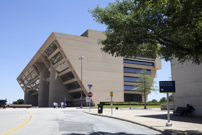
Dallas City Hall
After the assassination of President Kennedy, Dallas became known as “the city of hate,” a label then-mayor Erik Jonsson was determined to abolish. A new, forward-looking city hall was expected to play a major role in the city’s reinvention and modernist architect I.M. Pei was tasked with designing a symbol worthy of the new Dallas. Construction began in 1972 and it was six years before municipal workers settled in.Built of buff-colored concrete, the inverted pyramid juts out over an adjoining plaza at a 34-degree angle. Three massive pillars seem to support the structure, but in fact they were added only because Mayor Jonsson worried the original design would scare people, looking as if it could topple over. Despite initial controversy over its cost and avant garde appearance, Pei’s angular concrete and glass behemoth is generally recognized as a successful design. Five years ago, the Texas Society of Architects recognized the building for having “stood the test of time by retaining its central form, character, and overall architectural integrity.”

Hollenbeck Police Station, Los Angeles
If not for the word “POLICE” prominently displayed on the front of the Hollenbeck Police Station in Los Angeles, the building could easily be mistaken for a museum of modern art. In use since 2009, the eye-catching structure is one of several of the city’s police stations designed at the time to be less imposing and more welcoming to its neighbors. Soft colors and second-floor patios run contrary to the historical notion of what a police station ought to look like. But the front façade is what really sets this station apart from others. Providing a level of literal and figurative transparency, an undulating wall of frosted glass panels are suspended across the entire front of the building. They are not bulletproof, but the glass curtain wall behind them is.
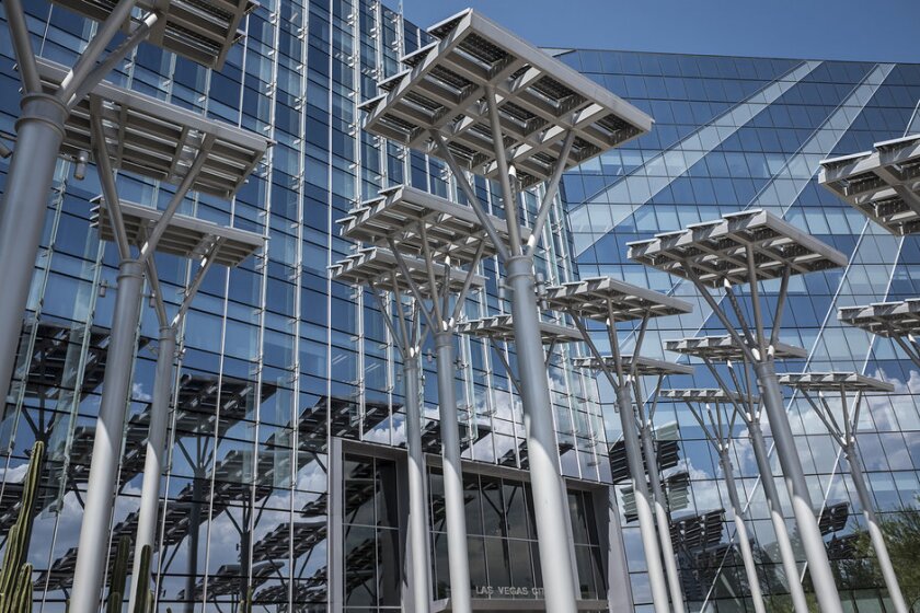
Las Vegas City Hall
The Las Vegas City Hall marries the gambling mecca’s unrestrained exuberance with a commitment to sustainability. The LEED-certified, glassy seven-story structure, built in 2012, features an array of 33 solar “trees” along its front with additional solar panels on the roof. Solar farms and the nearby Hoover Dam provide 100 percent renewable energy to city hall as well as every other government building, park, streetlight and traffic signal within city limits. Annual energy costs for the eight-year-old building are $500,000 less than they were for the old city hall.Goals for the new city hall went beyond sustainability. The building’s design serves as inspiration to all who visit and work within its walls. Common among many examples of modern government architecture, generous use of exterior glass is intended to invoke the concept of open government. Inside, colors and materials evoke local landscapes and reference the Indian Springs Preserve, the desert city’s original source of water. A revitalized downtown is taking shape around a city hall as unique as the city it governs.

Tulsa City Hall
Fans of art deco architecture know that Tulsa, Okla., is home to numerous examples of the style made popular in the decades before World War II. Built when the city was awash in oil money, the art deco structures celebrate the promise of the machine age with sleek geometric patterns and a vertical emphasis. A modern style for a modern age.But Tulsa’s current city hall comes from another modern age, a time when tech was the big play. Having outgrown the previous city hall, the city in 2007 relocated its government offices a few blocks away into One Technology Center, a modernist 15-story glass tower purchased from a bankrupt broadband provider. The move allowed the consolidation of services and employees while significantly reducing energy costs. Since city employees fill less than half the building’s floor space, the rest of the tower is leased, providing a source of revenue and providing future flexibility as needs change.
With its glass curtain walls and shiny metal columns at ground level, One Technology Center looks a lot more luxurious but less imposing than a typical government building. The previous mid-century modern city hall, more tolerated than loved for its design, is now a hotel. That building’s neo-classic predecessor has been repurposed as office space. A lease-to-own option for tenants of the new city hall will make it easier for the city’s offices to move again should a better option present itself.

Boston City Hall
Boston City Hall may be the most unloved public building in America. Reviled even before construction was complete in 1968, the brutalist structure has endured despite repeatedly being named “world’s ugliest building,” and “worst building in the city." Long-time beloved Mayor Tom Menino wanted to tear it down, sell the land to developers and construct a new city hall two miles away. He didn’t follow through only because of greater needs in a time of tight money.Generally panned by the public, professional critics and architects have been more forgiving, heaping praise on what others liken to a giant concrete harmonica. A 1976 poll of architects declared it one of the 10 most important buildings in America. But the consensus of opinion among regular users of the building is that the dank, dark monstrosity is difficult to navigate and just plain unpleasant to be in. The brutalist behemoth’s demise seems almost inevitable.

Thompson Center, Chicago
Chicago, birthplace of the skyscraper, is home to some of the most beautiful and important architecture in the country. Architecture tours of the city, either on foot, by bus or boat, are a popular activity all year. Because the Great Chicago Fire of 1871 destroyed nearly all of downtown, the city’s buildings are known more for their innovation and creativity than their age. Examples of design from different decades exist comfortably side by side throughout the center city. With at least one exception, the unloved Thompson Center, home to the offices of state employees.Looking like a well-worn spaceship on the outside, its half dome shape was intended to reference the dome of the state capitol. Inside, office workers look out over a 13-story glass atrium, again, meant to invoke thoughts of open and transparent government. The atrium is still impressive but because the originally intended insulated glass proved too costly, ordinary single-pane panels were installed, which turned the interior into a giant greenhouse. Years of deferred maintenance by a state strapped for cash did not help matters. There was even talk of selling the place, but it never went anywhere. Until now.
Recently, a firm was chosen to find a buyer for the property. The governor has pledged to put the proceeds of a sale toward the state’s underfunded pension system. It remains to be seen whether the next owner will repair or replace the 35-year-old postmodern building.

Clark County Government Center
Drawing inspiration from the surrounding Nevada desert landscape, the Clark County Government Center sits on nearly 40 landscaped acres of land within the boundaries of Las Vegas. Since its opening in 1995, the red sandstone complex has been popular with residents and visitors who take advantage of the several community gathering places inside the building and out. The center’s architects purposefully eschewed classic design elements in favor of open and accessible spaces that connect people with their government. With its soaring, 100-foot-high ceiling, the County Room and Rotunda is the Center’s focal point, its design mimicking rock formations at the nearby Valley of Fire and Red Rock Canyon parks. Blue and tan shades of granite on the floor represent a desert pool and sand.
Caltrans Headquarters, Los Angeles
The futuristic Caltrans District 7 Headquarters Building houses 2,500 employees of the California and Los Angeles departments of transportation. The award-winning LEED-certified building has the usual array of energy-saving features including controversial elevators that don’t stop on every floor to encourage the use of stairs. The hulking, glistening 13-story metallic structure appears to have no windows. They are hidden behind 2,000 shades that move with the sun, letting in light but not heat.The modernist building occupies an entire block across the street from the iconic Los Angeles City Hall. Both buildings, vastly dissimilar in appearance but stars in their own right, are favorite movie backdrops. The city doesn’t charge a fee to film them, beyond permit costs and paid mandatory supervising personnel. Not immune from criticism, the industrial-looking Caltrans headquarters has been likened to a deathstar and giant file cabinet. Thom Mayne, the building’s architect, thinks criticism of his design means he is doing something right. "There is no choice for a modern architect other than building a modern building,” he told the Los Angeles Downtown News in 2004. “You can't make a traditional building,"


